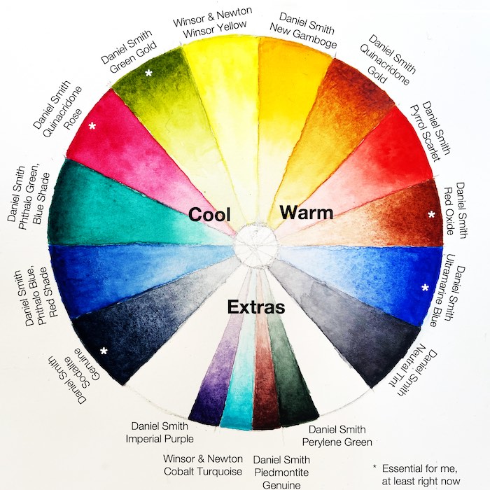
It is always changing. But with each iteration, I get closer to the perfect selections that capture the tone, mood and range I want available at all times during our travels.
Cool, Warm & Extras
I’ve been significantly influenced by Jane Blundell’s posts on the topic, particularly the “My Palette” section of this post. I’ve also spent longer than I’d care to admit looking through all the details on Handprint. My deep gratitude to both as well as to the countless artists who posted their own color experiences and recommendations online.
Trying to marry up the concepts of portability as well as color flexibility has been a daunting task. I’ve purchased way more tubes of paint that I need, but at least most of them were the 5ml size. I keep them all in this felt box that originally housed sewing notions. I’ve seen more extensive paint collections lurking in the background on YouTube videos, so I’m sure it could be worse but it still feels like a lot.


Cool Colors
- W&N Winsor Yellow
- DS Green Gold
- DS Quinacridone Rose
- DS Phthalo Green, Blue Shade
- DS Phthalo Blue, Red Shade
- DS Sodalite Genuine
Warm Colors
- DS New Gamboge
- DS Quinacridone Gold
- DS Pyrrol Scarlet
- DS Transparent Red Oxide
- DS Ultramarine Blue
- DS Neutral Tint
Extra Colors
- DS Imperial Purple
- W&N Cobalt Turquoise
- DS Piemontite Genuine
- DS Perylene Green
Color Mixing & My Essentials
Early in my watercolor exploration I tended to use colors straight from the pan and I grabbed way too many of them for any given painting. I tried to paint from a friend’s photo of a dragonfly in her garden and my result lacked any harmony based on me using such a wide range of “straight from the tube” green shades.
Two things helped me break through this approach, although I would say I still have a lot to learn about fully taking advantage of the colors I’ve selected. (See the next section for more on this.).
The first breakthrough moment was watching the full series of Steve Mitchell’s Mind of Watercolor series on his M. Graham set. I had seen others mix colors before, but something really “clicked” this time, especially when I tried to emulate his examples. I’ve linked the first of the series here.

The second breakthrough happened when I was trying to paint from a photo my sister had taken on vacation. The lighthouse had a blue-gray tint but there were also areas that were rusty, with a brownish, dirty tone. As I dug in, I was surprised that I could paint the entire thing with just two colors, Transparent Red Oxide and Ultramarine Blue. Granted, there’s a little bit of dark from Neutral Tint, but the blue to gray to red tones were a delight to me. The painting exercise that resulted wasn’t anything particularly special, but I couldn’t believe it was the result of two colors that on their own look so dissimilar from the finished result.

I like that color combination so much that I’ve dedicated a section of my Folio Pocket Palette by Expeditionary Art to Ultramarine Blue, Transparent Red Oxide and Green Gold. Rather than have to pull the colors into the mixing well from their individual pans, I’ve squeezed a little bit into 3 of the 4 corners of the mixing tin. This has given me a great start for so many of the paintings I attempt when I’m trying to capture the midwestern woods, field and sky.
So these 3 are definitely essential colors for me, at least for now.

My palette is organized with the cool colors on the left, warm on the right in the rectangular pans. I like to coat the bottom with a white epoxy paint to more easily see the paint’s consistency with the water and you can see that I only fill the left side of the pan. My “extras” are in the small square pans to the upper-right of the main colors.
This approach of only filling half of the pan may change moving forward. Right now it works well for me while I’m still working full time because I don’t have that much time to paint and I’m not going through a large volume of paint quickly. They last a long time for me, but perhaps down the road they won’t.
Colors to Explore
There are several colors in my palette that I rarely use. I’ve considered removing them entirely, but all of my sources and reference material indicate that they’ll help me down the road, perhaps when I’m painting a wider variety of subjects.
- Both Phthalo colors, (Phthalo Green, Blue Shade and Phthalo Blue, Red Shade) are rarely used. They just seem so strong & overwhelming.
- Winsor Yellow and New Gamboge – these are my lighter cool & warm yellows, but I find myself reaching for Green Gold and Qunacridone Gold more often for the deeper cool or warm yellow tones. Green Gold in particular is one I’m using all the time.
I suspect that I need to set aside time to restrict myself to just using those colors…find a few weeks to really explore them before I remove them from my palette. Who knows what I’ll learn!

